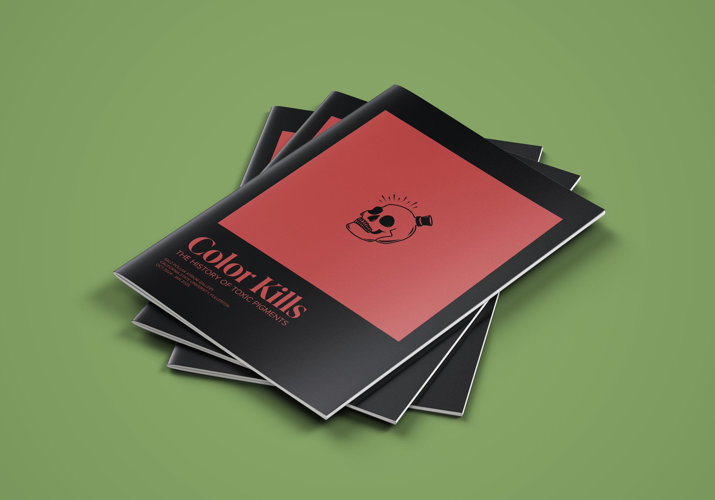
Color Kills
Color Kills was a collaborative exhibition design project that focused on creating an exhibition from the ground up — from concept and ideation, the curatorial statement, object list, concept plan, to branding. My role was primarily involved in the branding of the exhibit.
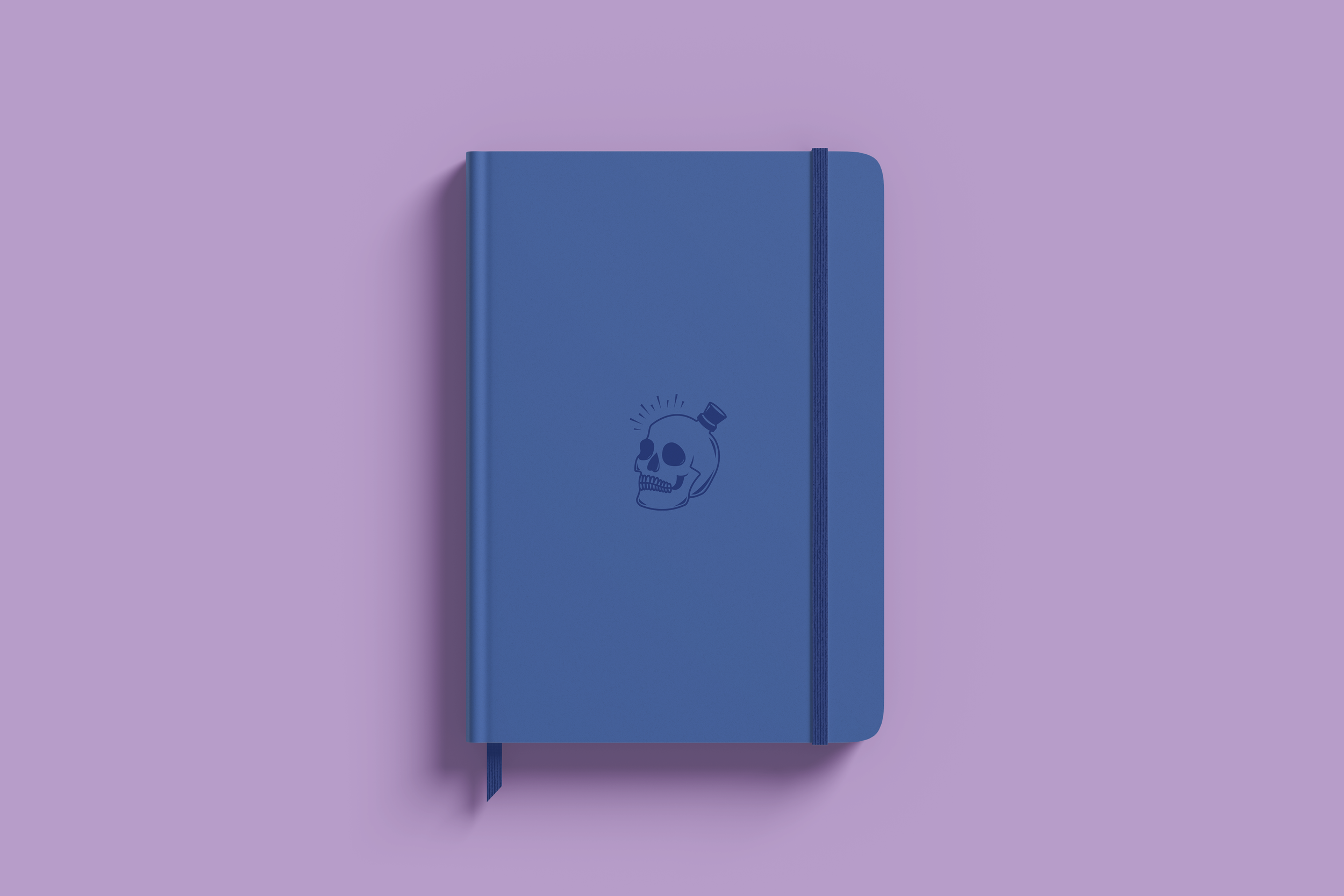
Color Kills aims to educate the audience about toxic pigments used historically, and show how this deadly past contributed to the advancement of the viable colors we use today. For the logo, I illustrated a skull to represent death and a cork top that is reminiscent of the apothecary bottles that toxic pigments used to be stored in. The serif typeface, IvyPresto Display, contrasts the sans-serif typeface, Proxima Nova, to visually communicate the evolution of colors from the past to present. The exhibit poster is a homage to Pantone color swatches. Color Kills logos were adapted onto different merchandise, such as stickers, tote bags, notebooks, and pins that the exhibition would sell.